Build a Todo application with Blazor and C#
"Hi there! Today, we’re going to build a to-do application—but with a twist. Unlike the typical to-do apps you might find in countless tutorials, this one will feature a sleek interface, smooth animations, and one or two more additional features beyond a regular to-do application.
Having said that I have to mention that this application does not intend to be flawless or a production ready product, but a nice looking and fun to use project for you to get started if you desire to learn blazor or maybe you already know but you like coding fun stuff, also the application design is not mine while I coded the app entirely from the markup, the styling and the C# code I got the design from Figma while looking for an amazing interface and I found it, so all credit goes to its author “itcenter uchquduq”. Ready to get started? Let’s dive in and bring this project to life!"
Give the project a start on Github
If you come across an issue, or while coding along with the article, something doesn’t look like it should, I recommend you to take a look at the code on Github to make sure your code is similar to mine. Also please if you enjoy coding this app give the project a start on Github to know that you liked it and create more projects like this one.
 Osempu
What You’ll Learn
- Build a Blazor WebAssembly App: Start from scratch and structure components like a pro.
- Craft Reusable UIs: Design components like
TodoHeaderandTodoComponentwith event handling and data binding. - Persist Data with local storage: Save tasks and theme preferences so nothing gets lost.
- Style with Flair: Implement a responsive dark/light theme using CSS variables and Line Awesome icons.
- Animate with CSS: Add slick transitions for adding/removing tasks (because details matter!).
- Filter Tasks Dynamically: Toggle between “All,” “Active,” and “Completed” tasks with real-time updates.
Create a new Blazor application
First, let’s start creating a new dotnet Blazor application using the dotnet cli with the following command.
dotnet new blazorwasm -o TodoApplication
This will create a new Blazor WebAssembly application with some boilerplate code that we will get rid of to start our application from scratch.
Get into your new project folder and open Visual Studio code with the following commands (you can use Visual Studio if you prefer; it will work as well)
cd TodoApplication
code . -r
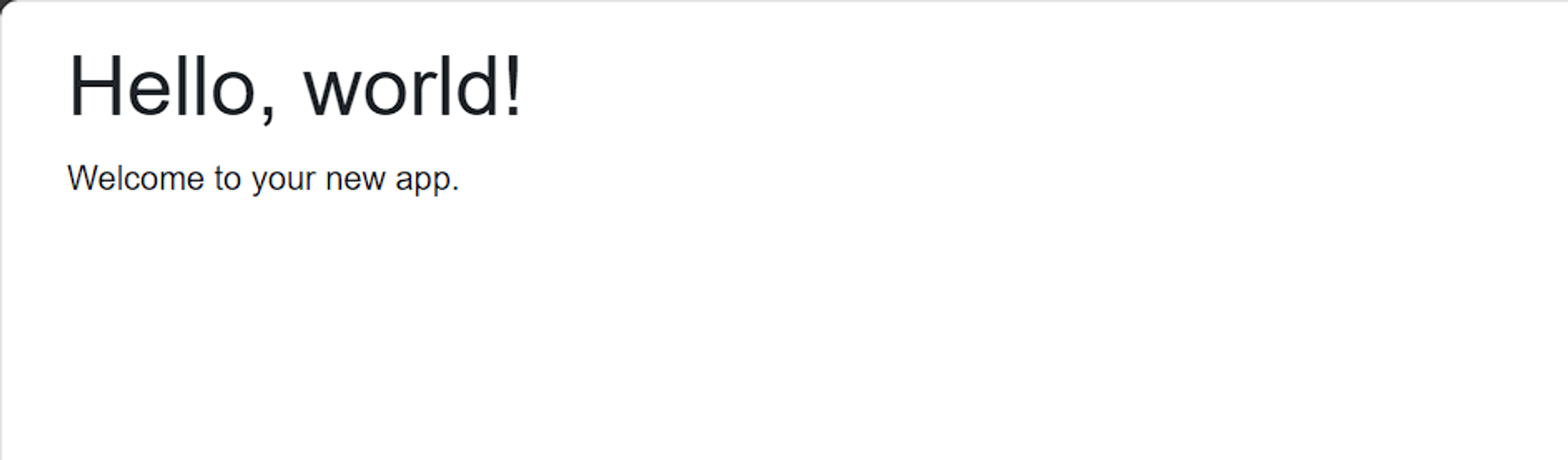
Now, let’s proceed to start removing some of the boilerplate codes so we can start working on our application. Go ahead and delete the Counter and Weather pages under the Pages folder. Now remove the NavMenu.razor component and NavMenu.razor.css from the Layout folder and in the MainLayout.razor component, remove the sidebar so the code looks like this.
@inherits LayoutComponentBase
<div class="page">
    <main>
        <article>
            @Body
        </article>
    </main>
</div>
 /*remove the styling for the article element*/
  .top-row, article {
      padding-left: 2rem !important;
      padding-right: 1.5rem !important;
  }
This will remove the sidebar and the top navbar with the About link so we can have a nice white canvas to start designing. Now, your application should look something like this. Nothing but the welcome text.
Let’s begin with the simplest implementation
We want to start by quickly implementing the simplest solution for the todo application; for that, we will create all the code in the home.razor file, and once done, we will move forward to create the components and add some complexity.
Remove Bootstrap and default styling
Let’s begin by removing the reference to the bootstrap library in the index.html file and in the app.css file, we will remove the undesired padding in the .content class, and we will also remove the margin and padding to the HTML and body elements.
<!--index.html-->

<!--Remove this line from the index.html file-->
<link rel="stylesheet" href="css/bootstrap/bootstrap.min.css" />
/*app.css*/
/*Lets reset the styling for theese elements*/
html, body {
...
margin: 0px;
padding: 0px;
box-sizing: border-box;
}
/*Remove this class to avoid clashing with our own content implementation*/
.content {
padding-top: 1.1rem;
}Create a Todo model
Now, let’s move on to create our to-do model that will hold the to-do name and whether it is done or not, so let’s add some default values for each of the properties.
namespace TodoApplication.Models;

public class Todo
{
    public string Title { get; set; } = string.Empty;
    public bool IsDone { get; set; } = false;
}
This will be our main class, which will be used through our application.
Adding just the very basics
For our first version, we will not be creating any component or adding any styling to the application; we will only rely on the HTML elements and some C# code.
/*Home.razor*/
<PageTitle>Todo Application</PageTitle>

<div class="app-container">
	<div class="hero">
		<div class="container">
	    <div class="header">
	        <h1 class="app-title">TODO</h1>
	    </div>

		<div class="body-container">
		    <input type="text" placeholder="Create a new todo..."
		        @bind="todoTitle"
		        @bind:event="oninput"
		        @onkeydown="AddTodo">

		    @foreach(var todo in todos) {
		        <div>
		            <label>
		                <input type="checkbox" @bind="todo.IsDone">
		                @todo.Title
		            </label>
		            <span class="remove-icon" @onclick="() => RemoveTodo(todo)">x</span>
		        </div>
		    }
	    </div>
		</div>
	</div>
</div>
We can see that the application is divided into three sections.
- The header, which will contain the application name
- The form by means of which we will create the tasks consists of a text input that we will bind its value to a string called
todoTitlethat will be the title for newly created tasks. Also, this input has abind:eventon theoninputevent to make sure we get the latest value inserted in the input, otherwise, we will always get the last value, and the first input will always be a blank string, and we don’t want that to happen. Lastly, theonkeydownevent will trigger the functionAddTodothat will check if the pressed key is theEnterkey and then will create the new task. - Finally, the tasks list(the code within the foreach loop) will contain every task created with a checkbox bound to the
IsDoneproperty of the task. The label will display theTodotitle, and finally, we have a button to remove the selected task.
For the C# code, we have the following:
@code {
	private List<Todo> todos = new List<Todo>();
	private string todoTitle = string.Empty;
	private void AddTodo(KeyboardEventArgs e) {
	    if (e.Key == "Enter" && !string.IsNullOrWhiteSpace(todoTitle)) {
	        var newTodo = new Todo() { Title = todoTitle };
	        todos.Add(newTodo);
	        todoTitle = string.Empty;
	    }
	}

	private void RemoveTodo(Todo todo) {
	    todos.Remove(todo);
	}
}
We have a list of Todo elements being this the todo list, we have a string value for the input that will create the new task. Then we have the AddTodo function that, as we mentioned before, passes the KeyboardEventArgs as a parameter, and inside, we check if the pressed key is the Enter key, and if it is, it will create a new Todo using the value from the todoTitle variable and will remove the value from todoTitle variable to reset the input element. Lastly, the RemoveTodo function, as the name suggests, removes the selected task. This code can be in the same Home.razor file for now right below the markup.
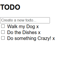
With this, we have our application working, we can create a task, mark it as completed, and remove it from the list. Now, we will take it to the next level, adding styling and some more features.
Leveling up our application
Now, it’s time to enhance our to-do application by creating components, adding awesome styling, and adding the necessary code.
First, let’s create the header component containing the application title, an icon to toggle the theme, and the form to input the todo title.
Creating the Header component
Start by abstracting the markup and code from the header into its own component, so start creating a folder named Components , and there you will be storing every new component that will be needed. Now, create a new component named TodoHeader.razor Here, you will move the corresponding markup and code to work as intended, but before adding any code, let’s write down what will be the responsibilities of the header component.
The header component will:
- Display the application title
- Display an icon to indicate whether the application is in dark or light mode.
- Emit an event to toggle between light or dark mode
- Display an image for dark mode and another one for light mode
So having said that, let’s move to the new header component, and also let’s add the new code for the features listed above.
/*TodoHeader.razor*/
@using Blazored.LocalStorage
@inject ILocalStorageService localStorage

<div class="header">
    <h1 class="app-title">@AppTitle</h1>
    <i class="@icon"
        @onclick="Toggle"></i>
</div>

@code {
    [Parameter]
    public string AppTitle { get; set; } = string.Empty;
    [Parameter]
    public EventCallback<bool> ToggleState { get; set; }
    [Parameter]
    public string LightIcon { get; set; } = string.Empty;
    [Parameter]
    public string DarkIcon { get; set; } = string.Empty;
    private bool isDarkMode = false;
    private string icon = string.Empty;

    protected override async Task OnInitializedAsync() {
        isDarkMode = await localStorage.GetItemAsync<bool>("IsDarkModeEnabled");
        icon = isDarkMode ? LightIcon : DarkIcon;
    }

    private async Task Toggle() {
        isDarkMode = !isDarkMode;
        await localStorage.SetItemAsync<bool>("IsDarkModeEnabled", isDarkMode);
        icon = isDarkMode ? LightIcon : DarkIcon;
        await ToggleState.InvokeAsync(isDarkMode);    }
}
Let’s start breaking down the code from top to bottom. First, you will see a reference to a library named Blazored.LocalStorage , which will help you manage the local storage in your application, allowing you to store the state of your theme application even after reloading it. We will also use it to store our tasks. Below, we are injecting the local storage service and naming it localStorage . This will allow you to use the service in your component.
Below is all the markup needed for the header component, there’s a wrapper container with a class named header, and inside of it is an h1 tag that’s holding the application title in a property, and below is the theme icon which will work as a toggle button to change between light and dark mode.
Then, at the top of the code section, we have some properties. The first one is the application title, followed by the ToggleState event callback that will be invoked when clicking on the toggle theme icon. The DarkIcon and LightIcon will be used to specify the icon used for the dark and light theme, as the properties before this will be passed as parameters so they can be configured when calling the header component. The isDarkMode variable will be used to check if the dark mode is active or not, and similarly, the icon variable will be used to get and set the current icon in the header.
We call the onInitializedAsync so that when the component is initialized, it checks for the IsDarkModeEnabled value in the local storage to set that in the isDarkMode variable. Based on that, it will set whether the icon displayed should be a light or dark icon. Lastly, the Toggle function will set the isDarkMode to the opposite value, then store that in the local storage, change the icon based on the variable, and invoke the ToggleState event callback, passing back the negated isDarkMode value.
Style for the header component
/*TodoHeader.razor.css*/
.header {
    display: flex;
    align-items: center;
    justify-content: space-between;
    width: 100%;
}

i.la-sun, i.la-moon {
    font-size: 3rem;
    color: #fff;
}

i.la-sun:hover, i.la-moon:hover {
    color: #ccc;
    cursor: pointer;
}

.app-title {
    font-size: 3rem;
    margin: 20px;
    margin-left: 0px;
    color: #FFF;
    text-align: left;
    user-select: none;
    letter-spacing: 1rem;
}
Create a new file at the same level as the header component file and name it TodoHeader.razor.css in this file, we will define the styling for this component.
Adding more styling to the app.css file
The following styling should be added in the app.css file to apply some global stylings to your application, I recommend you remove what you have in the file and add the styles below to avoid confusion. You will notice there are references to two images in the :root and .dark classes, those images can be downloaded from the repository of this project on my GitHub page, or you can use your own.
html, body {
    font-family: 'Roboto', Helvetica, Arial, sans-serif;
    margin: 0px;
    padding: 0px;
}

h1:focus {
    outline: none;
}

:root {
    /*Default Light Theme*/
    --primary-color: #fff;
    --secondary-color: #fafafa;
    --text-color: #000;
    --border-color: #eee;
    --accent-color:  linear-gradient(190deg, rgba(85, 150, 255, 0.8) 0%, rgba(172, 45, 235, 0.8) 100%);
    --bground-img: url('../img/bground.jpg');
    --accent-secondary-color: #f0f7f4;
    transition: background 0.3s;
}

.dark-theme {
    --primary-color: #25273d;
    --secondary-color: #171823;
    --text-color: #fff;
    --border-color: #5a5757;
    --bground-img: url('../img/bground-dark.jpg');
    --accent-color:  linear-gradient(190deg, rgba(80, 255, 100, 0.8) 0%, rgba(50, 150, 255, 0.8) 100%);
    --accent-secondary-color: #494C6B;
    transition: background 0.3s;
}

#blazor-error-ui {
    background: lightyellow;
    bottom: 0;
    box-shadow: 0 -1px 2px rgba(0, 0, 0, 0.2);
    display: none;
    left: 0;
    padding: 0.6rem 1.25rem 0.7rem 1.25rem;
    position: fixed;
    width: 100%;
    z-index: 1000;
}

#blazor-error-ui .dismiss {
    cursor: pointer;
    position: absolute;
    right: 0.75rem;
    top: 0.5rem;
}

.blazor-error-boundary {
    background: url(data:image/svg+xml;base64,PHN2ZyB3aWR0aD0iNTYiIGhlaWdodD0iNDkiIHhtbG5zPSJodHRwOi8vd3d3LnczLm9yZy8yMDAwL3N2ZyIgeG1sbnM6eGxpbms9Imh0dHA6Ly93d3cudzMub3JnLzE5OTkveGxpbmsiIG92ZXJmbG93PSJoaWRkZW4iPjxkZWZzPjxjbGlwUGF0aCBpZD0iY2xpcDAiPjxyZWN0IHg9IjIzNSIgeT0iNTEiIHdpZHRoPSI1NiIgaGVpZ2h0PSI0OSIvPjwvY2xpcFBhdGg+PC9kZWZzPjxnIGNsaXAtcGF0aD0idXJsKCNjbGlwMCkiIHRyYW5zZm9ybT0idHJhbnNsYXRlKC0yMzUgLTUxKSI+PHBhdGggZD0iTTI2My41MDYgNTFDMjY0LjcxNyA1MSAyNjUuODEzIDUxLjQ4MzcgMjY2LjYwNiA1Mi4yNjU4TDI2Ny4wNTIgNTIuNzk4NyAyNjcuNTM5IDUzLjYyODMgMjkwLjE4NSA5Mi4xODMxIDI5MC41NDUgOTIuNzk1IDI5MC42NTYgOTIuOTk2QzI5MC44NzcgOTMuNTEzIDI5MSA5NC4wODE1IDI5MSA5NC42NzgyIDI5MSA5Ny4wNjUxIDI4OS4wMzggOTkgMjg2LjYxNyA5OUwyNDAuMzgzIDk5QzIzNy45NjMgOTkgMjM2IDk3LjA2NTEgMjM2IDk0LjY3ODIgMjM2IDk0LjM3OTkgMjM2LjAzMSA5NC4wODg2IDIzNi4wODkgOTMuODA3MkwyMzYuMzM4IDkzLjAxNjIgMjM2Ljg1OCA5Mi4xMzE0IDI1OS40NzMgNTMuNjI5NCAyNTkuOTYxIDUyLjc5ODUgMjYwLjQwNyA1Mi4yNjU4QzI2MS4yIDUxLjQ4MzcgMjYyLjI5NiA1MSAyNjMuNTA2IDUxWk0yNjMuNTg2IDY2LjAxODNDMjYwLjczNyA2Ni4wMTgzIDI1OS4zMTMgNjcuMTI0NSAyNTkuMzEzIDY5LjMzNyAyNTkuMzEzIDY5LjYxMDIgMjU5LjMzMiA2OS44NjA4IDI1OS4zNzEgNzAuMDg4N0wyNjEuNzk1IDg0LjAxNjEgMjY1LjM4IDg0LjAxNjEgMjY3LjgyMSA2OS43NDc1QzI2Ny44NiA2OS43MzA5IDI2Ny44NzkgNjkuNTg3NyAyNjcuODc5IDY5LjMxNzkgMjY3Ljg3OSA2Ny4xMTgyIDI2Ni40NDggNjYuMDE4MyAyNjMuNTg2IDY2LjAxODNaTTI2My41NzYgODYuMDU0N0MyNjEuMDQ5IDg2LjA1NDcgMjU5Ljc4NiA4Ny4zMDA1IDI1OS43ODYgODkuNzkyMSAyNTkuNzg2IDkyLjI4MzcgMjYxLjA0OSA5My41Mjk1IDI2My41NzYgOTMuNTI5NSAyNjYuMTE2IDkzLjUyOTUgMjY3LjM4NyA5Mi4yODM3IDI2Ny4zODcgODkuNzkyMSAyNjcuMzg3IDg3LjMwMDUgMjY2LjExNiA4Ni4wNTQ3IDI2My41NzYgODYuMDU0N1oiIGZpbGw9IiNGRkU1MDAiIGZpbGwtcnVsZT0iZXZlbm9kZCIvPjwvZz48L3N2Zz4=) no-repeat 1rem/1.8rem, #b32121;
    padding: 1rem 1rem 1rem 3.7rem;
    color: white;
}

.blazor-error-boundary::after {
    content: "An error has occurred."
}

.loading-progress {
    position: relative;
    display: block;
    width: 8rem;
    height: 8rem;
    margin: 20vh auto 1rem auto;
}

.loading-progress circle {
    fill: none;
    stroke: #e0e0e0;
    stroke-width: 0.6rem;
    transform-origin: 50% 50%;
    transform: rotate(-90deg);
}

.loading-progress circle:last-child {
    stroke: #1b6ec2;
    stroke-dasharray: calc(3.141 * var(--blazor-load-percentage, 0%) * 0.8), 500%;
    transition: stroke-dasharray 0.05s ease-in-out;
}

.loading-progress-text {
    position: absolute;
    text-align: center;
    font-weight: bold;
    inset: calc(20vh + 3.25rem) 0 auto 0.2rem;
}

.loading-progress-text:after {
    content: var(--blazor-load-percentage-text, "Loading");
}
Calling the header component from the home page
Now, you can remove the old markup to display the app title and call the header component instead. You will have to pass the name of the application to the AppTitle parameter as well for the icons and for the ToggleState event callback,k you will pass the function that will be called when this event is triggered.
The OnInitializedAsync function was added to look for the stored appTheme value in the local storage. If it does not exist, then the default value will be an empty string. The ToggleTheme function receives a bool as a parameter, as you can see in the TodoHeader component, we are not passing any argument, so where is this value coming from? Well, it turns out that the ToggleState event callback is of type bool, and when you invoke it in the header component, you pass back that bool value when calling this line of code in the Toggle function await ToggleState.InvokeAsync(!isDarkMode) So that’s where that value is coming from, and what this function does is that it sets the app theme to dark-theme or to blank string depending on the flag it receives and then stores that value in the local storage. Now, this was,y you can have your component in place and ready to work, but before that let’s add some more styling to the application also you need to install some libraries to make everything work.
/*Home.razor*/
<div class="app-container @appTheme"> /*Dont forget to add this class to get the theme toggle working*/
    <div class="hero">
        <div class="container">
            <TodoHeader
                AppTitle="TODO"
                LightIcon="las la-sun"
                DarkIcon="las la-moon"
                ToggleState="ToggleTheme"
            />
        </div>
	    </div>
   ...

   @code {
   ...
      private string appTheme = string.Empty;

	  protected async override Task OnInitializedAsync() {
      //Get Theme values from Local Storage
      appTheme = await localStorage.GetItemAsync<string>("appTheme") ?? "";
    }
    ...
    private async Task ToggleTheme(bool isDarkTheme) {
      appTheme = isDarkTheme ? "dark-theme" : "";
      await localStorage.SetItemAsync<string>("appTheme", appTheme);
    }
    ...
  }
Styles for the home page
There's not much to say here; just adjusting the header layout and adding color to the background.
/*Home.razor.css*/
* {
    box-sizing: border-box;
}

.app-container {
    position: relative;
    background-color: var(--secondary-color);
    height: 100vh;
}

.hero {
    display: block;
    position: absolute;
    height: 40vh;
    background: var(--accent-color), var(--bground-img);
    background-size: cover;
    background-position: center 40%;
    mix-blend-mode: normal;
    width: 100%;
    min-width: 500px;
    transition: all .3s ease;
}

.footer {
    position: relative;
    display: block;
    height: 40vh;
    width: 100%;
}

.container {
    flex-direction: column;
    align-items: center;
    position: relative;
    margin: 50px auto;
    display: flex;
    width: 40%;
    transition:
    width 0.5s ease,
    height 0.5s ease,
    font-size 0.5s ease,
    transform 0.5s ease;
}

.remove-icon:hover {
    cursor: pointer;
}

.body-container {
    width: 100%;
}

@media only screen and (max-width: 1200px) {
    .container {
        width: 60%;
        transition: all .3s linear;
    }
}

@media only screen and (max-width: 720px) {
    .container {
        width: 80%;
        transition: all .3s linear;
    }
}
Using Line Awesome icons
To be able to use the sun and moon icons in our application, we will be using the Line Awesome icons library, which is free, and you can start using it by loading it from CDN, as shown below. Go to your index.html file and place this link above the head tag.
...
	link rel= "stylesheet" href= "<https://maxst.icons8.com/vue-static/landings/line-awesome/line-awesome/1.3.0/css/line-awesome.min.css" >
</head>
...
Install Blazored.LocalStorage NuGet package
To have the local storage working in our application, we will use a third-party library, which you can install using the command below.
dotnet add package Blazored.LocalStorage
Then, go to your Program.cs file and register your service there.
builder.Services.AddScoped(sp => new HttpClient { BaseAddress = new Uri(builder.HostEnvironment.BaseAddress) });
builder.Services.AddBlazoredLocalStorage(); //This is where you should place it.

await builder.Build().RunAsync();
And add the Blazored.LocalStorage reference in the Home page and TodoHeader component like shown below.
/*Add these two lines to both Home.razor and TodoHeader.razor*/
@using Blazored.LocalStorage
@inject ILocalStorageService localStorage
Now you can run your application, and it should look something like this.

Styling the todo input
Let’s make the to-do input element bigger and adjust it to the layout. Add the code below to the Home.razor.css and then take a look at the changes.
/*Home.razor.css*/
/* Todo Text Input */
input[type="text"] {
    padding-top: 15px;
    padding-bottom: 15px;
    padding-left: 30px;
    padding-right: 30px;
    margin-bottom: 20px;
    border-radius: 4px;
    width: 100%;
    border: none;
    font-size: 1.2rem;
    color: var(--text-color);
    background-color: var(--primary-color);
}

input::placeholder {
    font-size: 1.2rem;
}
Now it looks incredible and gives the application a fresh and professional look by making the font and the placeholder bigger as well as adjusting the size of the container.
For the todo form we will not be making it a component as the functionality is not that much so creating a component just for the sake of doing it would be an overkill so having said this, let’s move on.
Adding the tasks container and todo component
In the components folder, add the new TodoComponent and its styling sheet TodoComponent.razor.css.
/*TodoComponent.razor*/
@using TodoApplication.Models

<div class="checkbox-wrapper add-task @RemoveAnimation">
    <div class="task-container" @onclick="CheckTask">
        <input type="checkbox" @bind="Todo.IsDone">
        <label>
            <div class="tick-mark"></div>
        </label>
        <span class="task-title @StrikeoutClass">@Todo.Title</span>
    </div>
    <div class="icon-container">
        <i class="las la-times" @onclick="RemoveTodo"></i>
    </div>
</div>

@code {
    [Parameter]
    public Todo Todo {get; set;} = new();
    [Parameter]
    public EventCallback<Todo> OnRemoveTodo{get; set;}
    [Parameter]
    public EventCallback OnCheckTodo {get; set;}
    [Parameter]
    public string RemoveAnimation {get; set;} = string.Empty;
    private string StrikeoutClass => Todo.IsDone ? "strikeout-gradient" : "";


    private void CheckTask() {
        this.Todo.IsDone = !this.Todo.IsDone;
        OnCheckTodo.InvokeAsync();
    }

    private async Task RemoveTodo() {
        this.RemoveAnimation = "remove-task";
        await Task.Delay(300);
        await OnRemoveTodo.InvokeAsync(this.Todo);
    }
}
The markup is pretty straightforward: a wrapper with three classes to outline the container, add an animation when adding a new task, and an animation for when that task is removed. Within this wrapper, we have the checkbox bound to the Todo.IsDone property. Next to it, we have the label with a div to display the custom check. There is a span for the to-do title with a class to add a strikeout style to the text when the task is marked as done, and we also pass a function to the onclick event to mark the task as done when clicking on the label and an i tag to display the cross to remove the task so we also pass a function to the onclick event.
For the component code, we define a todo object that you can pass as a parameter, the todo unique identifier as a parameter, and two event callbacks: one for removing the current todo and the other to be fired up after checking the task as done. The StrikeoutClass function toggles the class to add the strikeout style based on the current todo IsDone value. The CheckTask function toggles the current todo IsDone value and the RemoveTodo function triggers the remove-task animation by adding the class to the component, waits 300 milliseconds, and invokes RemoveTodoCallback passing back the current task to be removed.
The styles are somewhat complex and I will not act like I understand all of this code, I took most of it from uiverse which is an incredible website where you can get inspiration from tons of designs made by other talented developers and reuse the code adjusting it to your needs as I did for the checkbox.
/*TodoComponent.razor.css*/
.checkbox-wrapper {
    display: flex;
    align-items: center;
    border-bottom: 0.5px solid var(--border-color);
    background-color: var(--primary-color);
    transition: transform 0.3s ease, opacity 0.3s ease;
  }

  .task-container {
    flex: 0 0 85%;
    display: flex;
    align-items: center;
    padding: 20px;
    cursor: pointer;
  }

  .checkbox-wrapper:hover .la-times {
    visibility: visible;
  }

  .checkbox-wrapper input[type="checkbox"] {
    display: none;
  }

  .checkbox-wrapper label {
    --size: 30px;
    --shadow: calc(var(--size) * .07) calc(var(--size) * .1);
    position: relative;
    display: block;
    width: var(--size);
    height: var(--size);
    background-color: #4158D0;
    background-image: var(--accent-color);
    border-radius: 50%;
    cursor: pointer;
    overflow: hidden;
    z-index: 1;
  }

  .checkbox-wrapper label:before {
    content: "";
    position: absolute;
    top: 50%;
    right: 0;
    left: 0;
    width: calc(var(--size) * .7);
    height: calc(var(--size) * .7);
    margin: 0 auto;
    background-color: #fff;
    transform: translateY(-50%);
    border-radius: 50%;
    box-shadow: inset 0 var(--shadow) #ffbeb8;
    transition: 0.2s ease width, 0.2s ease height;
  }

  .checkbox-wrapper label:hover:before {
    width: calc(var(--size) * .55);
    height: calc(var(--size) * .55);
    box-shadow: inset 0 var(--shadow) #ff9d96;
  }

  .checkbox-wrapper label:active {
    transform: scale(0.9);
  }

  .checkbox-wrapper .tick-mark {
    position: absolute;
    top: -1px;
    right: 0;
    left: calc(var(--size) * -.05);
    width: calc(var(--size) * .6);
    height: calc(var(--size) * .6);
    margin: 0 auto;
    margin-left: calc(var(--size) * .14);
    transform: rotateZ(-40deg);
  }

  .checkbox-wrapper .tick-mark:before,
    .checkbox-wrapper .tick-mark:after {
    content: "";
    position: absolute;
    background-color: #fff;
    border-radius: 2px;
    opacity: 0;
    transition: 0.2s ease transform, 0.2s ease opacity;
  }

  .checkbox-wrapper .tick-mark:before {
    left: 0;
    bottom: 0;
    width: calc(var(--size) * .1);
    height: calc(var(--size) * .3);
    box-shadow: -2px 0 5px rgba(0, 0, 0, 0.23);
    transform: translateY(calc(var(--size) * -.68));
  }

  .checkbox-wrapper .tick-mark:after {
    left: 0;
    bottom: 0;
    width: 100%;
    height: calc(var(--size) * .1);
    box-shadow: 0 3px 5px rgba(0, 0, 0, 0.23);
    transform: translateX(calc(var(--size) * .78));
  }

  .checkbox-wrapper input[type="checkbox"]:checked + label {
    background-color: #4158D0;
    background-image: var(--accent-color);

  }

  .checkbox-wrapper input[type="checkbox"]:checked + label:before {
    width: 0;
    height: 0;
  }

  .checkbox-wrapper input[type="checkbox"]:checked + label .tick-mark:before,
    .checkbox-wrapper input[type="checkbox"]:checked + label .tick-mark:after {
    transform: translate(0);
    opacity: 1;
  }

  .task-title {
    margin-left: 10px;
    font-size: 1rem;
    color: var(--text-color);
    cursor: pointer;
  }

  .icon-container {
    flex-grow: 1;
  }

  .la-times {
    margin-left: auto;
    cursor: pointer;
    color: var(--text-color);
    font-size: 1.5rem;
    visibility: hidden;
  }

  .la-times:hover {
    background-color: rgba(240, 240, 240, 0.8);
    padding: 2px;
    border-radius: 50%;
    color: #0a0a0a
  }

  .strikeout-gradient {
    background-image: var(--accent-color);
    -webkit-background-clip: text;
    background-clip: text;
    -webkit-text-fill-color: transparent; /* Makes the gradient visible */
    position: relative; /* Enables positioning of the pseudo-element */
  }

  .strikeout-gradient::after {
    content: ''; /* Required for pseudo-element */
    position: absolute;
    left: 0;
    right: 0;
    top: 50%; /* Positions the line in the middle of the text */
    height: 2px; /* Adjust for thickness of the line */
    background-color: rgba(0, 0, 0, 0.5); /* A semi-transparent black or any desired color */
    transform: translateY(-50%); /* Centers the line perfectly */
  }

  /* Add Animation */
  .add-task {
    animation: grow 0.3s ease backwards;
  }

  /* Keyframes for grow (adding a task) */
  @keyframes grow {
    0% {
        opacity: 0;
        transform: scale(0.5);
    }
    100% {
        opacity: 1;
        transform: scale(1);
    }
  }

  /* Remove Animation */
  .remove-task {
    animation: shrink 0.3s ease forwards;
    opacity: 0;
  }

  /* Keyframes for shrink (removing a task) */
  @keyframes shrink {
    0% {
        opacity: 1;
        transform: scale(1);
    }
    100% {
        opacity: 0;
        transform: scale(0.5);
    }
  }
Now place your TodoComponent inside the foreach loop at the home page to display all the tasks in the list and pass the values for all its parameters as shown below. Also, add the following style rules to your Home.razor.css style sheet above the media queries section. As you may have noticed, we are still not passing a handler to the OnCheckTodo event, we will do that in a moment.
<!-- Home.razor -->
<div class="body-container">
    <input type="text" placeholder="Create a new todo..." @bind="todoTitle" @bind:event="oninput"
        @onkeydown="AddTodo">

     <div class="todos-container">
          @if(!todos.Any())
          {
               <p class="no-tasks-text">
                   Start adding some tasks! ✅
               </p>
           }
           else
           {
                @foreach (var todo in todos)
                {
                    <TodoComponent
                       Todo="todo"
                        RemoveAnimation="@String.Empty"
                        OnRemoveTodo="RemoveTodo"/>
                }
           }
      </div>
</div>
/*Home.razor.css*/
.todos-container {
background-color: #fff;
box-shadow: 0 6px 12px rgba(0, 0, 0, 0.15), 0 2px 4px rgba(0, 0, 0, 0.12);
border-top-left-radius: 5px;
border-top-right-radius: 5px;
overflow-x: hidden;
background-color: var(--primary-color);
overflow-y: scroll;
height: auto;
max-height: 400px;
}
.no-tasks-text {
padding: 5px;
text-align: center;
color: #8f8f8f;
font-weight: 500;
}
::-webkit-scrollbar {
width: 6px;
}
::-webkit-scrollbar:horizontal {
height: 6px;
}
::-webkit-scrollbar-track {
background: transparent;
}
::-webkit-scrollbar-thumb {
border-radius: 10px;
background-color: #aaa;
opacity: 0;
transition: opacity 0.3 ease;
}Your to-do app is looking more and more stunning as you continue adding more stuff.
Storing tasks in local storage
The next step is to save the list of tasks to local storage so you don’t lose your tasks every time the application is refreshed or closed. You have to modify 3 methods on the home page and create another one to be used in the TodoComponent.
   /*Home.razor*/
    <TodoComponent
        Todo="todo"
        RemoveAnimation="@String.Empty"
        OnRemoveTodo="RemoveTodo"
        OnCheckTodo="UpdateTodoList"/> // Add the update todo handler

    ...
    protected async override Task OnInitializedAsync() {
        //Get Theme values from Local Storage
        appTheme = await localStorage.GetItemAsync<string>("appTheme") ?? "";

        // Getting the todos from local storage when initializing the application
        todos = await localStorage.GetItemAsync<List<Todo>>("todos") ?? Enumerable.Empty<Todo>().ToList();
    }

    private async Task AddTodo(KeyboardEventArgs e) {
        if (e.Key == "Enter") {
            var newTodo = new Todo() { Title = todoTitle };
            todos.Add(newTodo);
            //Updated the todos in the local storage after adding a todo
            await localStorage.SetItemAsync("todos", todos);
            todoTitle = string.Empty;
        }
    }

    // This method will be used in the Todo component in a moment
    private async Task UpdateTodoList() {
        await localStorage.SetItemAsync("todos", todos);
    }

    private async Task RemoveTodo(Todo todo) {
        todos.Remove(todo);
        // Update todos in the loca storage after removing a todo
        await localStorage.SetItemAsync("todos", todos);
    }
With this, you update the tasks list every time you add a new task or remove and get the saved tasks list from the local storage when the application is refreshed and the UpdateTodoList method will be passed as a handler to the OnRemoveTodo event in the TodoComponent to update the list after marking a task as done.
Adding the tasks filter
You have come to the last section of this article, Here, you will add a task filter to display how many tasks remain, filter by some criteria, and remove completed tasks. For this, you have to create the TodoFilter component.
/*TodoFilter.razor*/
<div class="filter-container">
    <span class="items-left"> @ItemsLeft items left</span>

    <InputRadioGroup @bind-Value="selectedOption">
        <div class="radio-group">
            @foreach(var filter in FilterOptions)
            {
                <label @onclick="() => FilterTasksBy(filter.Key)" class="radio-label">
                    <span class="radio-mask">
                        <InputRadio Value="@filter.Key"/>
                    </span>
                    @filter.Value
                </label>
            }
        </div>
    </InputRadioGroup>

    <span class="clear-completed" @onclick="ClearCompletedTasks">Clear Completed</span>
</div>

@code {
    [Parameter]
    public int ItemsLeft { get; set; }
    [Parameter]
    public Dictionary<string, string> FilterOptions { get; set; } = new();
    [Parameter]
    public EventCallback ClearCompleted { get; set; }
    [Parameter]
    public EventCallback<string> FilterBy { get; set;}
    private string selectedOption = "all";

    private void ClearCompletedTasks() {
        selectedOption = "all";
        ClearCompleted.InvokeAsync();
    }

    private void FilterTasksBy(string taskStatus) {
        selectedOption = taskStatus;
        FilterBy.InvokeAsync(taskStatus);
    }
}
This component consists of a span displaying the number of tasks left, a set of InputRadio elements that will filter the tasks by their status and a button to clear all completed tasks from the list. You must pass the number of tasks left, the filtering options, and the handlers for FilterBy and ClearCompleted events as parameters for this component. The clearCompletedTasks method will reset the selected filter option to all and then invoke the clearCompleted event, the FilterTasksBy method does something similar as it sets the selectedOption to the filter option selected and then invoke the FilterBy event passing back the task status.
For the styling, we are just using flexbox to get everything horizontally aligned and hiding the radio input to only show its label, and applying style if the input is checked.
/*TodoFilter.razor.css*/
.filter-container {
    display: flex;
    align-items: center;
    justify-content: space-between;
    width: 100%;
    padding: 20px;
    box-sizing: border-box;
    background-color: var(--primary-color);
    box-shadow: 0 6px 12px rgba(0, 0, 0, 0.15), 0 2px 4px rgba(0, 0, 0, 0.12);
    border-bottom-left-radius: 5px;
    border-bottom-right-radius: 5px;
    overflow-x: hidden;
}

 span {
    font-size: 10pt;
    color: #afafaf;
    font-weight: bold;
}

span:hover:not(:first-child) {
    cursor: pointer;
    font-size: 10pt;
    color: #6f6f6f;
    font-weight: bold;
}

.radio-group {
    display: flex;
    gap: 3px;
    justify-items: center;
}

.radio-group label{
  padding: 2px 4px;
  cursor: pointer;
  font-size: 10pt;
  font-weight: bold;
  color: #afafaf;
  transition: transform 0.3s ease, background-color 0.3s ease, color 0.3s ease;
}

.radio-group label:has(input:checked) {
  color: #5596FF;
  transform: scale(1.09);
}

.radio-mask {
  display: none;
}
Let’s move ahead and use our new component in our app!
/*Home.razor*/
...
<TodoFilter
    ItemsLeft="todos.Count()"
    FilterOptions="filterOptions"
    FilterBy="FilterTodoList"
    ClearCompleted="ClearCompletedTasks"/>
...

@code {
    // This dictionary will hold the list of filters
    public Dictionary<string, string> filterOptions = new();

    protected async override Task OnInitializedAsync() {
        /*Code ommited for brevity*/

        //Add the filters instead of hardcoding them in the component
        filterOptions.Add("all", "All");
        filterOptions.Add("active", "Active");
        filterOptions.Add("completed", "Completed");
    }

    // Return the filtered list after selecting the desired filter option
    private async Task FilterTodoList(string filterOption)
    {
        todos = await localStorage.GetItemAsync<List<Todo>>("todos") ?? Enumerable.Empty<Todo>().ToList();

         todos = filterOption switch
        {
            "active" =>  todos.Where(x => !x.IsDone).ToList(),
            "completed" => todos.Where(x => x.IsDone).ToList(),
            _ =>  await localStorage.GetItemAsync<List<Todo>>("todos") ?? Enumerable.Empty<Todo>().ToList()
        };
    }

    // Clear all the tasks that are marked as done
    private async Task ClearCompletedTasks() {
        todos = await localStorage.GetItemAsync<List<Todo>>("todos") ?? Enumerable.Empty<Todo>().ToList();
        todos = todos.Where(x => !x.IsDone).ToList();
        await localStorage.SetItemAsync("todos", todos);
    }
}
Place the TodoFilter component below the tasks container and pass the parameters listed previously, you have to create a <string, string> dictionary to hold the filter values along with the text that will be displayed in the component, then add the filter options inside the OnInitialized method to make sure the filter is not empty when running the application. The FilterTodoList method gets the tasks list from the local storage and then filters the list based on the status of the task and the ClearlCompletedTasks also gets the stored tasks from the local storage and then removes the ones that have been marked as done.
Your Todo app is now complete!
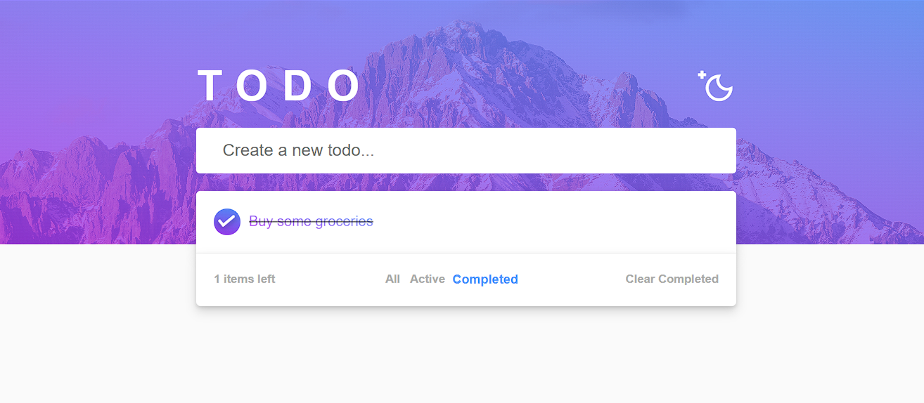
Your application is now complete and ready to streamline your tasks! You can seamlessly add, remove, filter, and clear completed items or switch to dark mode for a visually comfortable experience. I hope you’ve found the process as rewarding as I did—while perfection wasn’t the goal, creating something functional and enjoyable while learning Blazor certainly was.
If you’d like to see more articles like this or have ideas to enhance future tutorials, feel free to share your thoughts. Thank you for joining me on this journey, and I look forward to connecting again soon!